cefet_web
CSS - Parte 6
Roteiro de hoje
- Media Queries
- Responsive Design
- Pré-processadores
- Frameworks CSS
Media Queries
Media Queries
- O maior propósito da Web é ser disponibilizada nos mais diversos meios de comunicação/dispositivos
- Hoje em dia, podemos acessar a Web à partir de:
- computadores pessoais, notebooks
- videogames, videogames portáteis
- televisores
- smartphones, tablets, telefones celulares “tradicionais”, etc.
- Com uma gama de configurações diferentes entre os dispositivos, estávamos limitados a montar as páginas Web que eram exibidas da mesma forma em todos eles
- Especificadas no CSS3, as media queries têm o propósito de possibilitar a delimitação do escopo de regras CSS para diferentes mídias
Media Queries
- Exemplos:
- Arquivo com regras CSS para impressão ```html
1. Dentro de um arquivo CSS, regras diferentes para o tamanho de uma imagem
   se o dispositivo estiver orientado verticalmente (_portrait_) ou
   horizontalmente (_landscape_)
   ```css
   img.produto {  width: 200px;  }
   @media screen and (orientation: landscape) {
     img.produto {  width: 100%;  }
   }
Anatomia de uma media query
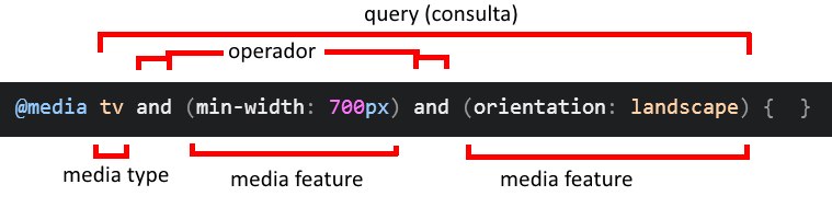
- Formada por:
- Media types
- Media features
- Operadores
Tipos de Mídia
all- Qualquer dispositivo
print- Para documentos paginados ou exibidos em modo de visualização de impressão
screen- Dispositivos com telas coloridas
speech- Para sintetizadores de voz
Exemplo de uso de tipo de mídia
- Arquivos externos:
<link rel="stylesheet" media="all" href="estilos-gerais.css" />
<link rel="stylesheet" media="screen" href="p-monitores.css" />
<link rel="stylesheet" media="print" href="p-impressao.css" />
Exemplo de uso de tipo de mídia (cont.)
- Dentro de um mesmo arquivo:
#artigo-principal {
  background-color: #ccc;
}

@media print {
  #artigo-principal {
    background-color: transparent;
  }
}
Características de Mídia
width,height,max-width,max-height,min-width,min-height- Largura e altura da janela do navegador
aspect-ratio- Razão da largura pela altura da janela do navegador
orientation- Orientação (
landscapexportrait) do dispositivo
- Orientação (
resolution- Densidade de pixels do dispositivo
- E mais…
Exemplo de uso de características de mídia
- Arquivos externos:
<!-- Arquivo de estilo para dispositivos pequenos -->
<link rel="..." media="all and (max-width: 640px)" href="small.css" />

<!-- Arquivo de estilo para dispositivos grandes -->
<link rel="..." media="all and (min-width: 641px)" href="large.css" />
Exemplo de uso de características de mídia (cont.)
- Dentro de um mesmo arquivo
div#logo {
  background-image: url('img/logo.png');
}
/* 2dppx = 2 dots per pixel unit */
@media screen and (min-resolution: 2dppx) {
  div#logo {
    background-image: url('img/logo2x.png');
  }
}
Retina display (da Apple)
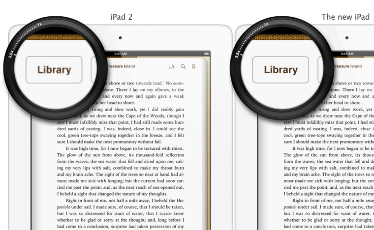
Retina display (da Apple)

Simulação de retina display


Para testar em um dispositivo de tela com alta densidade de pixels:

Responsive Design
Responsive Design
- Não significa desenho responsável =)
- É a idéia de que as páginas Web devem se adaptar à plataforma que a está
exibindo
- Melhorar a experiência de usuário
- Aproveitar características específicas de plataformas diferentes
- Usa o recurso de media queries do CSS3
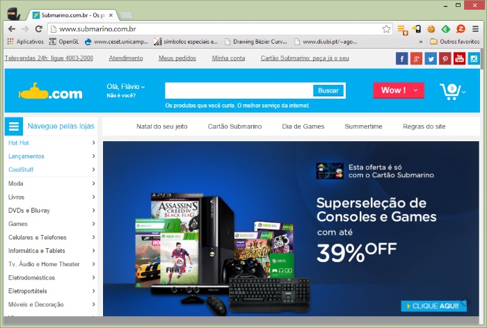
Exemplo de site não-_responsive_
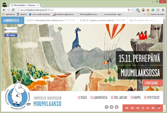
Exemplo de site responsive
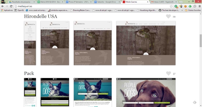
Vários exemplos
Como fazer
- Para criar uma página responsive, você deve
- Usar medidas fluidas (em porcentagem)
- Definir os pontos de dimensão (largura, altura) em que sua página “quebra” (os breakpoints)
- Criar regras de estilos diferentes para cada conjunto de dimensões
- Por exemplo, vamos criar uma página que mostra
- 4 produtos por linha em dispositivos grandes
- 3 produtos por linha em dispositivos médios
- 2 produtos por linha em dispositivos pequenos
Exemplo
div.produto {  display: inline-block; }

@media (min-width:801) and (max-width: 1024px) {
  /* tela grande: 4 produtos por linha */
  div.produto {  width: 25%;  }
}

@media (min-width:481px) and (max-width: 800px) {
  /* tela média: 3 produtos por linha */
  div.produto {  width: 33.333%;  }
}

@media (max-width: 480px) {
  /* tela pequena: 2 produtos por linha */
  div.produto {  width: 50%;  }
}
Exemplo vivo
Frameworks CSS
Frameworks CSS
- Existem bases de código para estilização “básicas” de páginas Web disponíveis
- A idéia é: para fazer uma prototipação rápida, não levar muito tempo se preocupando com escrever código CSS para tornar o produto bem apresentável
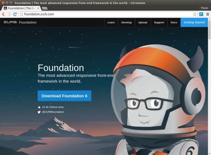
- Dois frameworks mais famosos:
- Na prática, você vai incluir um arquivo CSS na sua página
<link rel="stylesheet" href="bootstrap.css">
<link rel="stylesheet" href="meus-estilos.css">
Bootstrap
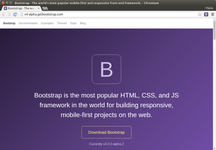
Bootstrap (cont.)
- Foi criado por funcionários do Twitter
- Usa Less para gerar CSS, mas também há um port para Sass
- É bastante “jQuery-friendly”, possuindo plugins para coisas comuns
- Painéis modais
- Abas
- Carrossel, etc.
Zurb Foundation
- Criado e mantido pela Zurb, uma empresa de criação na Web
- Escrito em Sass
- Também é “jQuery-friendly”, assim como Bootstrap
- Usa a filosofia mobile-first
- Incentiva a boa prática de não se utilizar “classes de apresentação”
(
.row,.columnetc.s)
Zurb Foundation (cont.)
Pré-processadores
Motivação
- Algumas tarefas em CSS são tediosas
- Criar imagens sprite e o CSS para configurar cada uma
- Escrever a mesma regra várias vezes usando prefixos de navegadores diferentes
Motivação (cont.)
- Além disso, o CSS não é muito DRY-
friendly
- Você acaba repetindo a mesma cor, as mesmas dimensões e outros valores
várias vezes
div.fundo { background-color: #3399ff; } body { color: #3399ff; } - Escrevendo seletores mais complexos, também acabamos por ter que nos repetir
.animal { width: 200px; }
.animal img { width: 1800px; }
.animal figcaption { width: 100%; }
- Você acaba repetindo a mesma cor, as mesmas dimensões e outros valores
várias vezes
Problema
- Queremos resolver alguns pontos fracos da linguagem CSS
- Mas os navegadores só conhecem a linguagem para definir estilos e não há movimentação de algum grupo criando outra linguagem
- Uma solução:
- Criar uma linguagem mais poderosa e que resolva esses pontos fracos, mas que se transforme em CSS para que os navegadores fiquem felizes
Pré-processadores CSS
- São uma extensão à linguagem CSS cujo objetivo é trazer recursos não presentes (ainda) na linguagem
- O pré-processador irá processar o código fonte nessa nova linguagem e transformá-lo em CSS, que é o que o navegador entende
- Os mais populares:
O que eles oferecem?
- Criação de constantes
- Para poder reutilizar valores
- Criação de variáveis
- Para constantes com efeito colateral - iteração
- Criação de funções para geração de código
- Para evitar criar código repetido
- Hierarquia de seletores
- Para evitar a repetição de partes de seletores
Constantes e Variáveis (em Sass)
- Código fonte
$font-stack: Helvetica, sans-serif; $primary-color: #333; body { font: 100% $font-stack; color: $primary-color; } - “Compilado” para CSS:
body {
  font: 100% Helvetica, sans-serif;
  color: #333;
}
Constantes e Variáveis (em Less)
- Código fonte
@font-stack: Helvetica, sans-serif; @primary-color: #333; body { font: 100% @font-stack; color: @primary-color; } - “Compilado” para CSS:
body {
  font: 100% Helvetica, sans-serif;
  color: #333;
}
Constantes e Variáveis (em Stylus)
- Código fonte
font-stack Helvetica, sans-serif primary-color #333 body font 100% font-stack color primary-color - “Compilado” para CSS:
body {
  font: 100% Helvetica, sans-serif;
  color: #333;
}
Regras aninhadas
- Possibilita a não-repetição de seletores pela definição de regras aninhadas
- Exemplo: Código fonte em sass e resultado:
ul {
  list-style: none;
  li {  display: inline-block;  }
}
ul { list-style: 0; } ul li { display: inline-block; }
Mixins
- Uma espécie de função para reutilização de código fonte
- Exemplo: Código fonte em sass e resultado:
@mixin border-radius($radius) {
  -webkit-border-radius: $radius;
     -moz-border-radius: $radius;
      -ms-border-radius: $radius;
          border-radius: $radius;
}
.box { @include border-radius(10px); }
.box { -webkit-border-radius: 10px; /*... */ }
Loops, Funções
- Execução de funções para gerar CSS dinamicamente
- Exemplo: Código fonte em less e resultado:
.generate-columns(@n, @i: 1) when (@i =< @n) {
  .column-@{i} {
    width: (@i * 100% / @n);
  }
  .generate-columns(@n, (@i + 1));
}
.generate-columns(4);
.column-1 { width: 25%; } .column-2 { width: 50%; } .column-3 { width: 75%; } .column-4 { width: 100%; }
Extensão de classes
- Similar ao mixin, para reutilização de código. Porém, reutiliza o código gerado
- Exemplo: Código fonte em stylus e resultado:
.message padding 10px; border 1px solid gray .warning @extend .message color rebeccapurple.message, .warning { padding: 10px; border: 1px solid #eee; } .warning { color: rebeccapurple; }
E muitos outros recursos
- Geração automática de imagens sprite e do código CSS para apontar para cada imagem
- Operadores
- Interpolação
- Condicionais (if/else)
- Arquivos parciais, etc.
Referências
- How to choose breakpoints, Google sobre responsive design
- Media Queries na MDN
- mediaqueri.es, Exemplos de sites responsive
- Sass, site oficial
- Less, site oficial
- Stylus, site oficial
- Bootstrap, site oficial
- Zurb Foundation, site oficial